Big Data and the City: Finding Pearls in London’s Oysters
As more real-time data about London becomes available through increased automation, so the quantity of archive data available to researchers has been steadily increasing. The use of smart cards and public “Application Programming Interfaces” (APIs) now gives researchers access to facets of the city not seen before. How “Big Data” (the subject of Built Environment 42.3) is best defined might not be in relation to its size, but in the way that it is used. Rather than design an experiment to collect data to prove or disprove a theory, with the archives of data that now exist about cities, researchers can begin with the data and look for a theory.
In London, the underground system (aka ‘the tube’) is run by Transport for London (TfL), who provide a public API called “trackernet” which allows us access to the position of all 460 tube trains at three minute intervals. Similarly, for the bus system, where there are 7,200 buses during peak hours, public data is readily available, except that here a continuous stream pushes data directly to our server whenever a change occurs. The Network Rail data contains the positions of up to 900 trains in London and is another example of a “stream API”, although in this case the stream also contains how late the train is running based on the timetable. This highlights one key problem with obtaining data from three different sources, namely how to combine data containing related, but slightly different information.
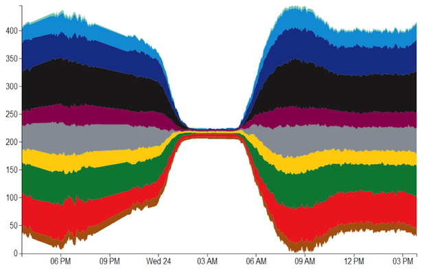 Figure 1: Tube stream graph for 24 April 2013 at 15:30
The graph in Figure 1 shows the number of London Underground trains running over a 24 hour period, while Figure 2shows the gate entry and exit totals for every station on the network. Currently, the only source of data about people on the London Underground is from the Oyster Card or this gate entry and exit data. In both cases, data is only available for selected periods of time and not available in real-time. The rush-hour peaks occur around 9am and 6pm GMT, which is a feature of all London transport data as people travel to and from work. The colours represent the 10 different tube lines in the official TfL colours. The archive data makes it possible to calculate expected waiting times for every platform and every hour of the day, so operational problems can be detected as they happen.
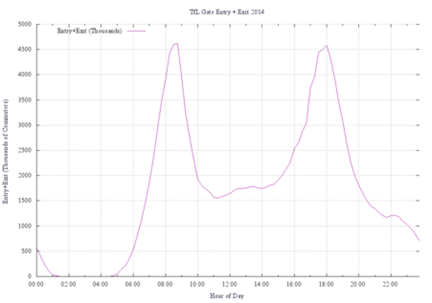 Figure 2: London Underground gate entry and exit from TfL data archive
When the night tube launched on the Central and Victoria lines on Friday 19th August 2016, it was possible to see the effect in the real-time data. Figure 3 shows the total number of tubes running over the launch weekend. The two arrows show the Friday night and Saturday night periods, which is replicated in Figure 4 for just the Central and Victoria lines. The total of around 20 tubes running throughout the night, with a total capacity of around 800 passengers each is a significant extra capacity.
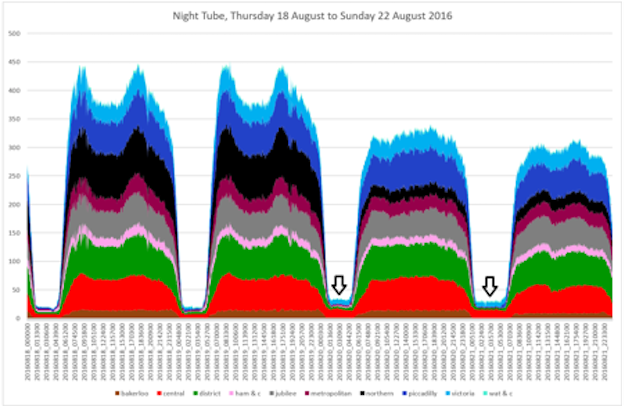 Figure 3: Stacked area chart showing the total number of tubes running on all lines from midnight on Thursday 18th August 2016 through to midnight on the following Monday morning.
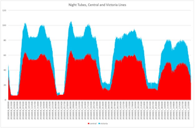 Figure 4: Stacked area chart showing the number of tubes running on the Central and Victoria lines only.
The exercise was repeated when the Jubilee Line night service launched on 7th October 2016, with the results shown in Figure 5. Now there are almost 40 tubes running through the night on weekends.
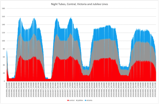 Figure 5: Stacked area chart showing the number of tubes running on the Central, Jubilee and Victoria lines only. The data shows Thursday 6th October 2016, Friday, Saturday and Sunday.
The interesting thing to do now would be to run a public transport accessibility analysis using the real-time running data to see which parts of the city are now more connected over the weekend. The recent Southern Rail strikes show how important this can be to commuters, with major disruption on lines into Victoria from areas south of London, and the associated knock-on effect on the underground system. Using the Census travel to work data it would be possible to forecast the areas where people are going to be late for work because of transport failures. This could potentially give a measure of what effect any strikes, or even just “congestion” generally, is having on London.
The “Quant” model, which is being developed as a collaboration between CASA and the Future Cities Catapult, is a website which allows users to explore the link between transport, population and employment. The graphic in Figure 6 shows the result of modifying the rail network with the proposed new Crossrail links, which will run between Reading and Heathrow in the west, Central London and then Shenfield and Abbey Wood in the east. This is a spatial interaction model which models population change based on improved transport links. A difficulty with this type of analysis is that it relies on the calculation of “all pairs shortest paths”. The model contains 7,201 population and employment zones based on the Census 2011 “middle layer super output areas” (MSOA) boundaries. This an O(N2) calculation if the shortest path between every pair of zones is required. By implication, then, a change to the network, which is termed the “dynamic all pairs shortest paths” problem, will require the travel time matrix to be recalculated. With the UK rail network (3,165 vertices and 10,269 edges), this took of the order of an hour on an Intel i7-5960X @3GHz with 16 processing threads. By comparison, the bus network with 290,000 vertices and 420,000 edges took 8 hours and the road network with 3,500,000 vertices and 8,400,000 edges took 72 hours.
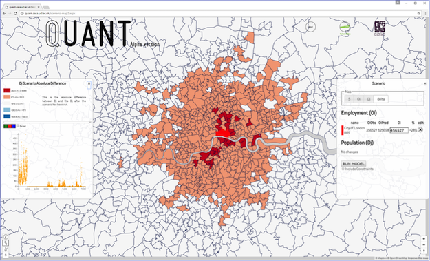 Figure 6: Quant website showing the effect of adding 100,000 jobs in City of London
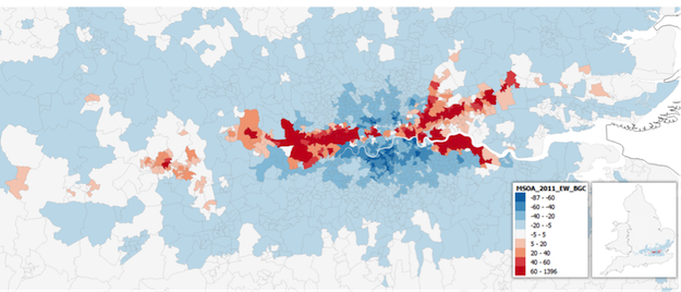 Figure 7: All mode shifts in employed population along Crossrail for London and the SE. The three modes of road, bus and rail compete with each other, resulting in a reduction of population in some places.
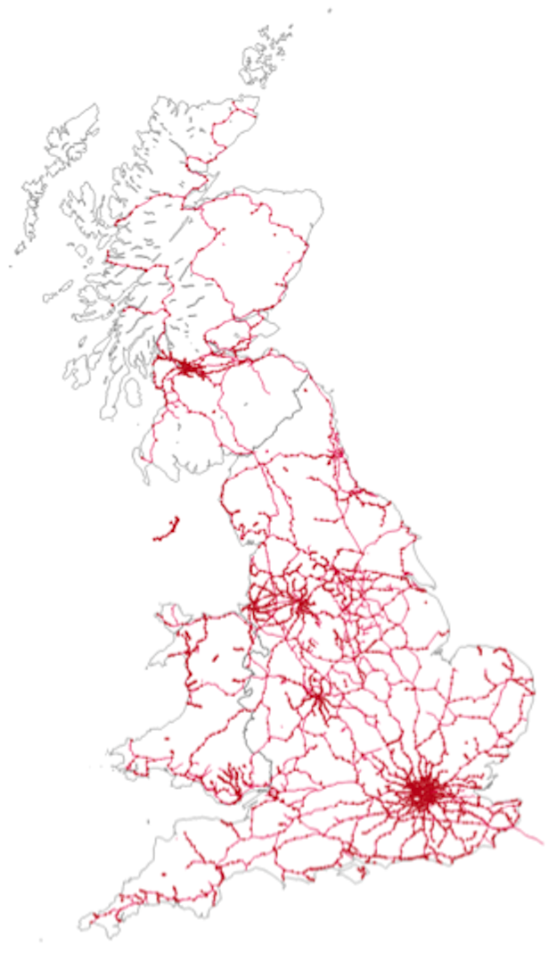 Figure 8: UK Rail network containing 3,165 vertices and 10,269 edges
The current challenges in the “Quant” model are with its size and computational complexity when scaled up to the level of England and Wales. Previous models like the “Tyndall model” only covered a limited area of the country like London and the southeast. When dealing with bus and rail transport data for Quant, this obviously meant having to process data for all the timetables for all services running in England and Wales. Being able to change a network link and see the effect on the working population in real-time is a new feature. The natural extension of this is to bring together the real-time transport data feeds with the Quant modelling capability to see the effect that transport disruptions are having on the city in real-time.
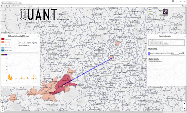 Figure 9: The effect on population of adding a new 10 minute link between Richmond and Goodge Street
________________________________________________________________
All images are courtesy of the author.
As ever we welcome further Built Environment blogs & tweets on this theme!


